Step 1 - Dimensions for Ads
Make sure to follow these sizing guidelines depending on the type of ad ordered!
Full Page: Up to 6 photos and 200 words
Ad Sizing: 48p6 by 75p0 (vertical)
1/2 Page: Up to 4 photos and 100 words
Ad Sizing: 48p6 by 37p0 (horizontal)
1/4 Page: Up to 2 photos and 50 words
Ad Sizing: 23p9 by 37p0 (vertical)
1/8 Page: Up to 1 photo and 25 words
Ad Sizing: 23p9 by 18p0 (horizontal)
Ad Sizing: 48p6 by 75p0 (vertical)
1/2 Page: Up to 4 photos and 100 words
Ad Sizing: 48p6 by 37p0 (horizontal)
1/4 Page: Up to 2 photos and 50 words
Ad Sizing: 23p9 by 37p0 (vertical)
1/8 Page: Up to 1 photo and 25 words
Ad Sizing: 23p9 by 18p0 (horizontal)
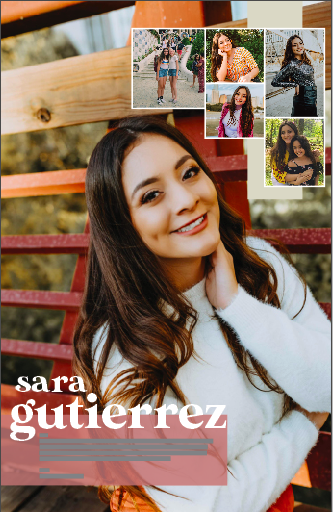
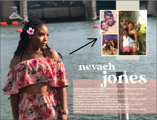
Step 2 - Dominant Photo Selection and Placement
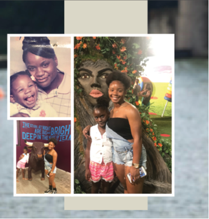
Dominant Photo: Choose the best, most recent photo (ideally the largest) as the background according to the orientation of the ad. Try to also choose a photo with blank space in the background in order to place text boxes, other photos, and the title later on. Place a rectangular frame that covers the entire ad size to place it into. When you are scaling the ad hold down shift so that the photo is not stretched. Do NOT flip the photos!
Step 3 - Placement of Other Photos
|
Photo Placement: Pick a place that has a good amount of blank space in order to place the other photos in the ad (if there is more than one photo). Try to group the photos in a module-like formation as shown to the side.
Make sure to follow these guidelines after sizing your photos and finding an ideal spot on your ad to place the additional photo(s):
|
|
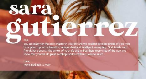
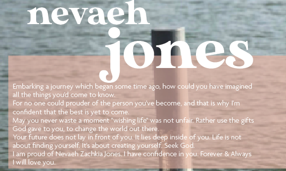
Step 4 - Message Box
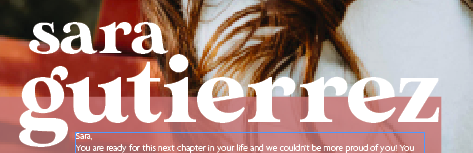
Message Box: Make a box using the rectangle tool and format it to have no border and a background color of one of our 7 pull colors (choose a color that compliments the photo, not the neon). Place the pox so that it bleeds of horizontally on either the right or left side. Then, make a text box and place your text DIRECTLY into that box. Make sure this text box has no background and no border color and place this box with the text directly on top of the box you made. Format your text to be Agenda Regular font in 8.5pt. Size the box according to the amount of text. If part of the message is an inspirational quote or verse, italicize the quote.
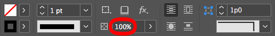
Then, select the box and a selection screen like the one below will appear at the top of your screen. Go to where it says 100% below and drag it to 60-80% (in increments of 10, with the preferred default being 80%) transparency (depending on the photo and the readability). This will allow the box to look semi-transparent like the ones in the examples below.
Then, select the box and a selection screen like the one below will appear at the top of your screen. Go to where it says 100% below and drag it to 60-80% (in increments of 10, with the preferred default being 80%) transparency (depending on the photo and the readability). This will allow the box to look semi-transparent like the ones in the examples below.
|
|
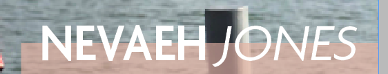
Step 5 - Title/Name Placement
Title/Name Selection: Make two separate boxes and put the first name of the individual in one box and the last name of the individual in the other. If you are designing an ad in which the individual wants their middle name in the ad, put the middle name in the box with the first name. If you are designing a group ad, such as Bowie Yearbook for example, put Bowie in the first box and Yearbook in the second box.
Follow the guidelines below for the names:
Follow the guidelines below for the names:
- Bring the top of the transparent box (the one the message is written in) up to be able to accomodate the lower half of the last name.
- First names should be in one font, designing all proofs with Made Sunflower in all lowercase (look at the options below). If a parent has an issue with the name being lowercase then use the Agenda example below. The last name should be larger than the first name: 20pt-76pt depending on name length and ad size. The last name splits the top of the transparent bar halfway across the word and the first name should nestle within the last name (adjust to be aesthetically pleasing).
- Can be in black or white (depending on the dominant photo and the readability, but aim for using white if possible)
- Can be ONE of the following if there is an issue with the initial Made Sunflower pairing: (Just keep in mind, the name needs to be readable with the transparent bar and photo)
- Agenda Light with Agenda Bold Italic
- Agenda Light Italic with Agenda Bold Italic
- Agenda Regular with Agenda Semibold Italic
- Agenda Regular Italic with Agenda Semibold
|
Use this only if the initial version (in all Made Sunflower lowercase) is not approved by the parent.
|
Step 6 - Horizontal Bar Behind Photos
Create a box using the rectangle tool with no border and filled with the pearl color. The bar should be no thicker than a third of the entire of the width of the photo package. Then center the bar behind the photos.
Step 7 - Finished!
Make sure to move anything in your ad that needs to be adjusted and don't let the modular photos or the text box touch the white border. Double check each element of your ad and then save it as the individual's or organization's first and last name as an InDesign document (.indd) under the folder Senior Ads 2020 for Proofing (under Marketing & Sales folder). Make sure that your ad looks elementally similar to the one below and if it doesn't or you have any questions, ask Grace (preferably) or Ms. Shirack for help. Then you are done! Yay!